
25 Years of RA
This university project focused on creating an album cover and a cohesive branding package tailored to a subject of personal interest. I chose to delve into Resident Advisor—a leading magazine and promotional platform renowned for its dedication to advancing the electronic music culture.
My research involved an in-depth exploration of Resident Advisor’s core values, mission, and the visual identity that defines their current branding. This enabled me to understand how they communicate their commitment to the electronic music community through design and messaging.
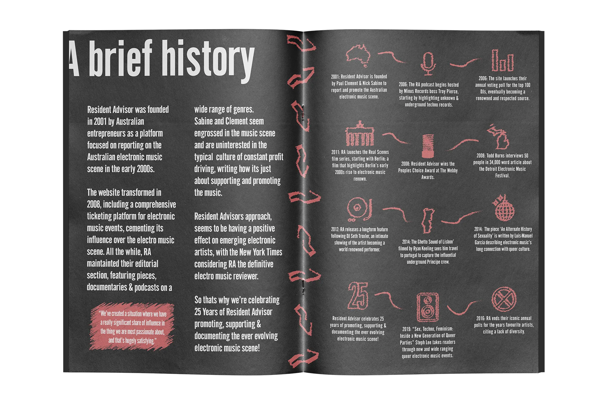
“Resident Advisor is an online music magazine and community platform established in 2001 and dedicated to showcasing electronic music, artists and events across the globe.”
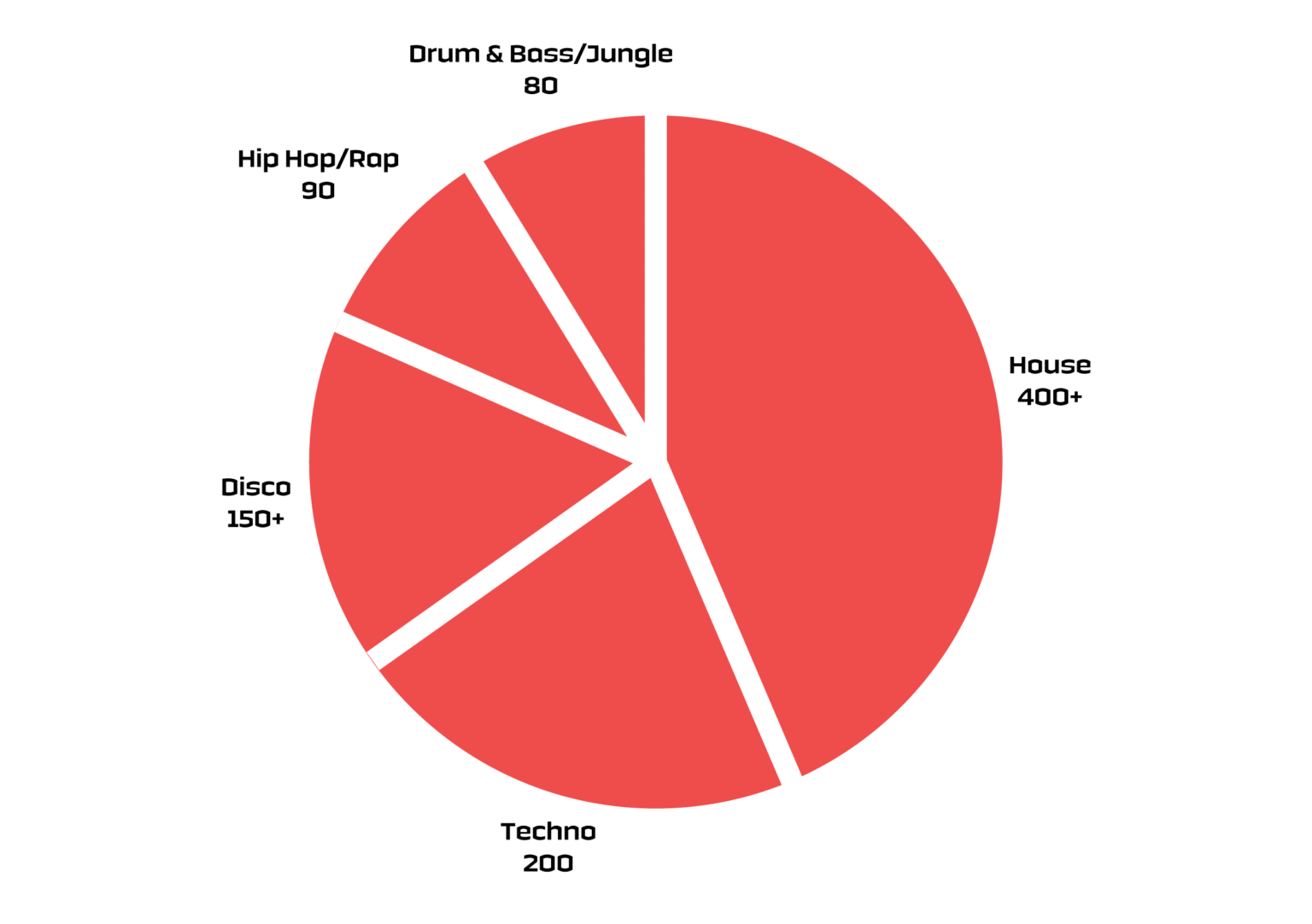
Resident advisor was originally established as an electronic music, online magazine & news site with the intention of showcasing new music, artists and genres within the electro music space.
Established in 2001, the news site has become the defacto news source for the genre through its credible and dependable reporting. The site now also includes an online ticketing platform for electronic music events, gigs and club nights that is also now the defacto booking website for such events.
“We’ve created a situation where we have a really significant share of influence in the thing we are most passionate about, and that’s hugely satisfying.”
The platform has garnered a passionate readerbase that appreciates it’s in depth analysis and editorial pieces, the owners (Paul Clement & NickSabine) commenting about how one of their editorswrote a 34,000 world article:
“There’s a single feature [by him] on the history of the electronic music festival in Detroit that’s 34,000 or so words and he talked to more than 100 people and it’s all direct quotes, interviewed the Detroit mayor, [included] loads of old photos. Todd was just a beast.”
Brand Principles
Sabine and Clement seem to be really engrossed in the music scene and are uninterested in the typical corporate culture of constant profit driving and investment, often at the detriment of the company culture and consumer. This seems to be something the pair are aware of, The Guardian mentioning:
“Both Sabine and Clement insist, however, that making big money isn’t, and has never been, the point. They also say they have no interest in selling up.”
Resident Advisor seems to distance itself from the common tropes of music news publication too by limiting themselves to serious topics and research into the wide umbrella of electronic music instead of gossip or click-bait-y news.
“Other popular dance sites like – run news items about the antics of celebrity DJs. Resident Advisor’s most popular news article this month was on a far more esoteric subject: the death of Charanjit Singh, an Indian musician credited with ‘accidentally inventing acid house’ in the early 1980s.”
Resident Advisors approach to promoting music seems to have a positive effect on emerging electronic artists careers, with the editorial side of the site, according to the New York Times, considered the definitive electro music reviewer. The Times mentions a short film produced by RA, about Black Coffee – a South African DJ – highlighting the company’s commitment to championing electronic music to new listeners.
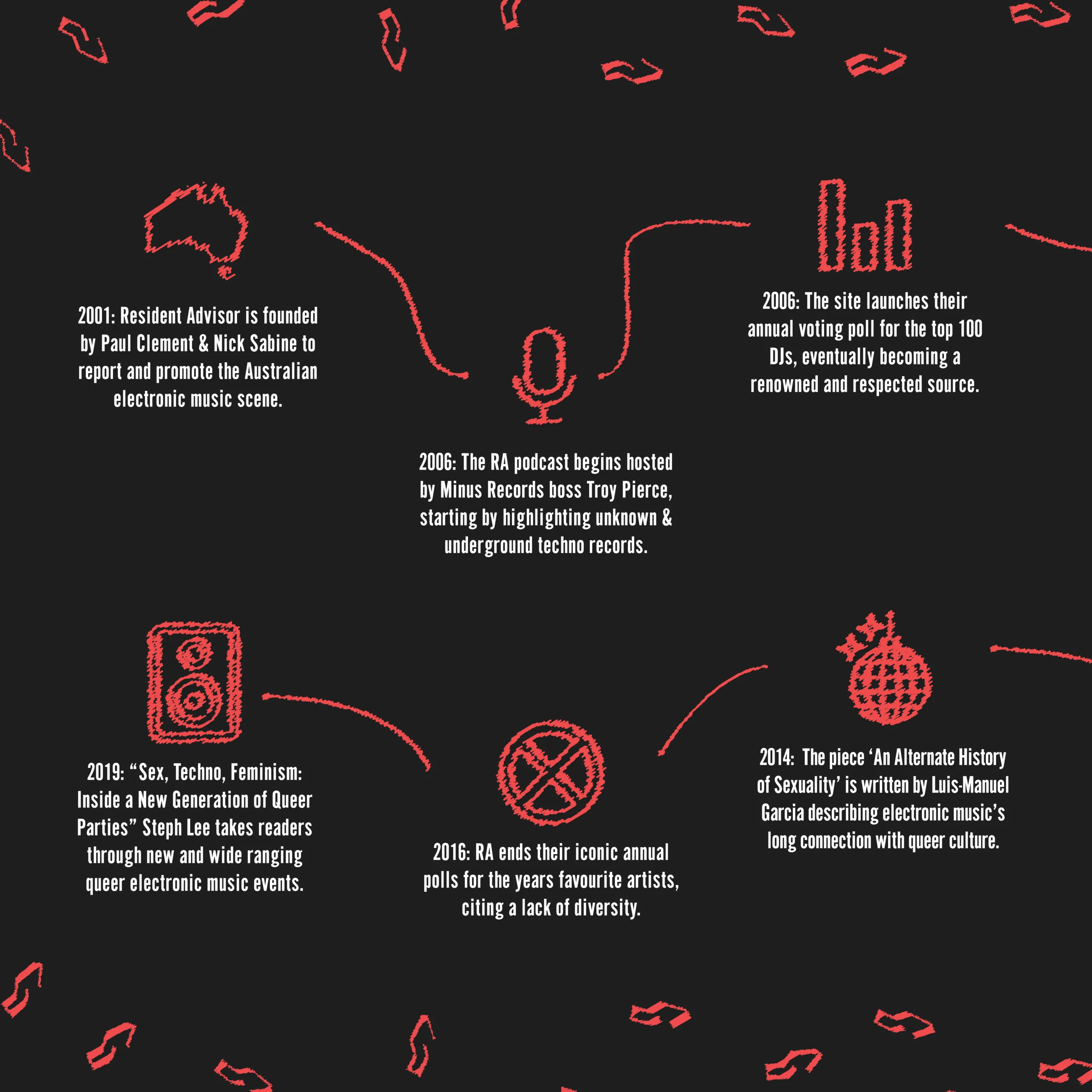
A caveat to this, is RA’s decision to stop their yearly polls for the year’s best acts in 2016 after deciding the polls were not sufficiently diverse with the continually growing user base not fairly representing the underground music scene.
Environmental Graphics
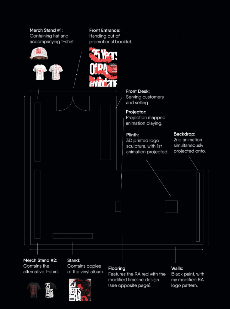
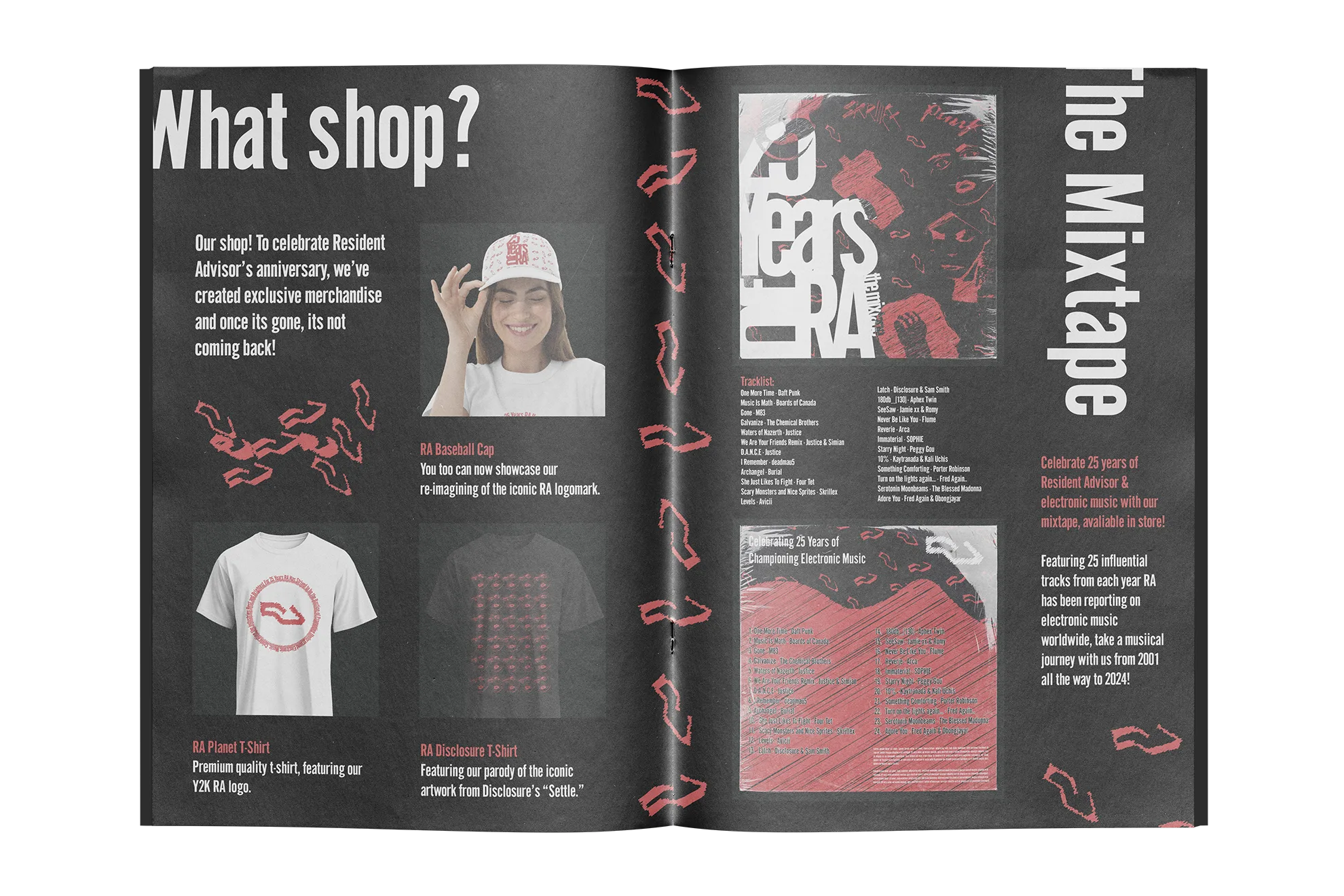
For the environmental graphics I figured it might be worth exploring a storefront, since I’d created clothing mock-ups. So, to do this, I imagined a storefront layout (see left), planning where each item would go and then the details for each. For example, I came up with ideas for the flooring and wall art which can be seen on the next page.
Another feature I decided on for the store, was a projection mapping. This would be two animations with one playing on to a blank white wall and the second playing only on a 3D printed version of the album cover typography. I settled on the first draft of the animation featuring; the background would be my reimagining for the RA logo moving constantly, and the foreground would be my version of the face from settle by disclosure with the eyes moving directions.
This animated feature would be in the right- hand corner of my store plan, playing in its own secluded area to emphasise it, without other store objects distracting viewers. The rest of the store would be composed with the merchandise to go along with the mixtape and the vinyl of the mixtape itself.
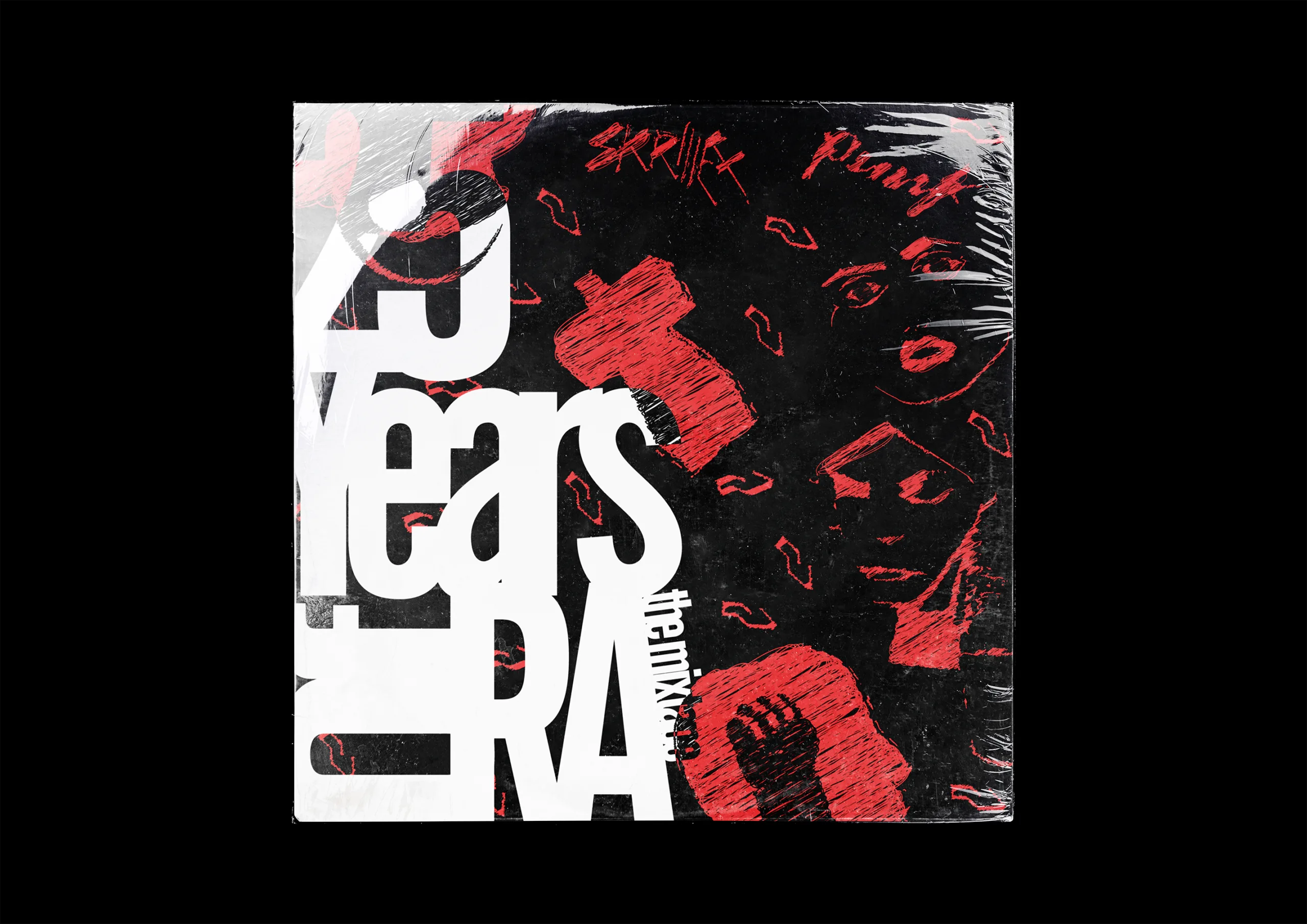
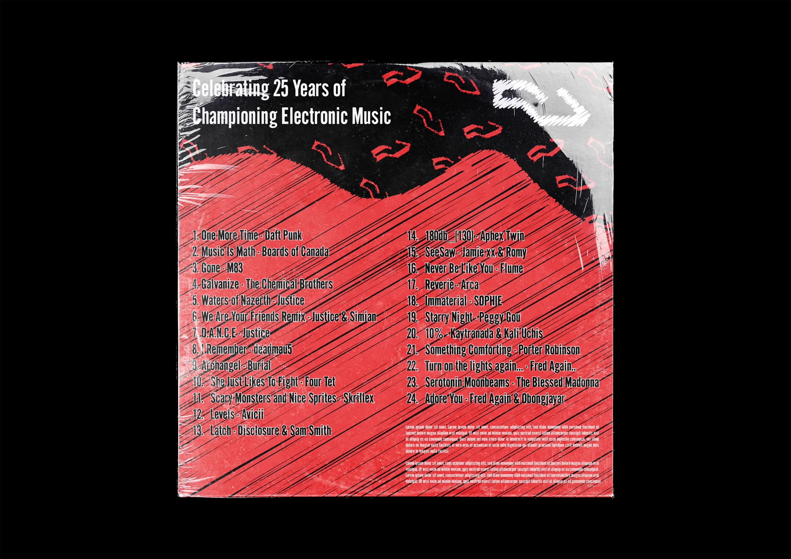
The booklet
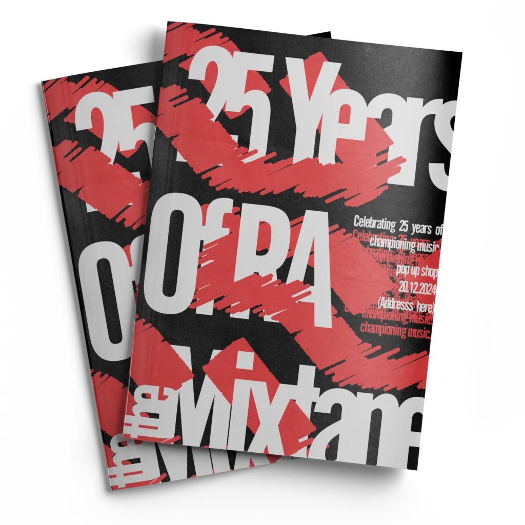
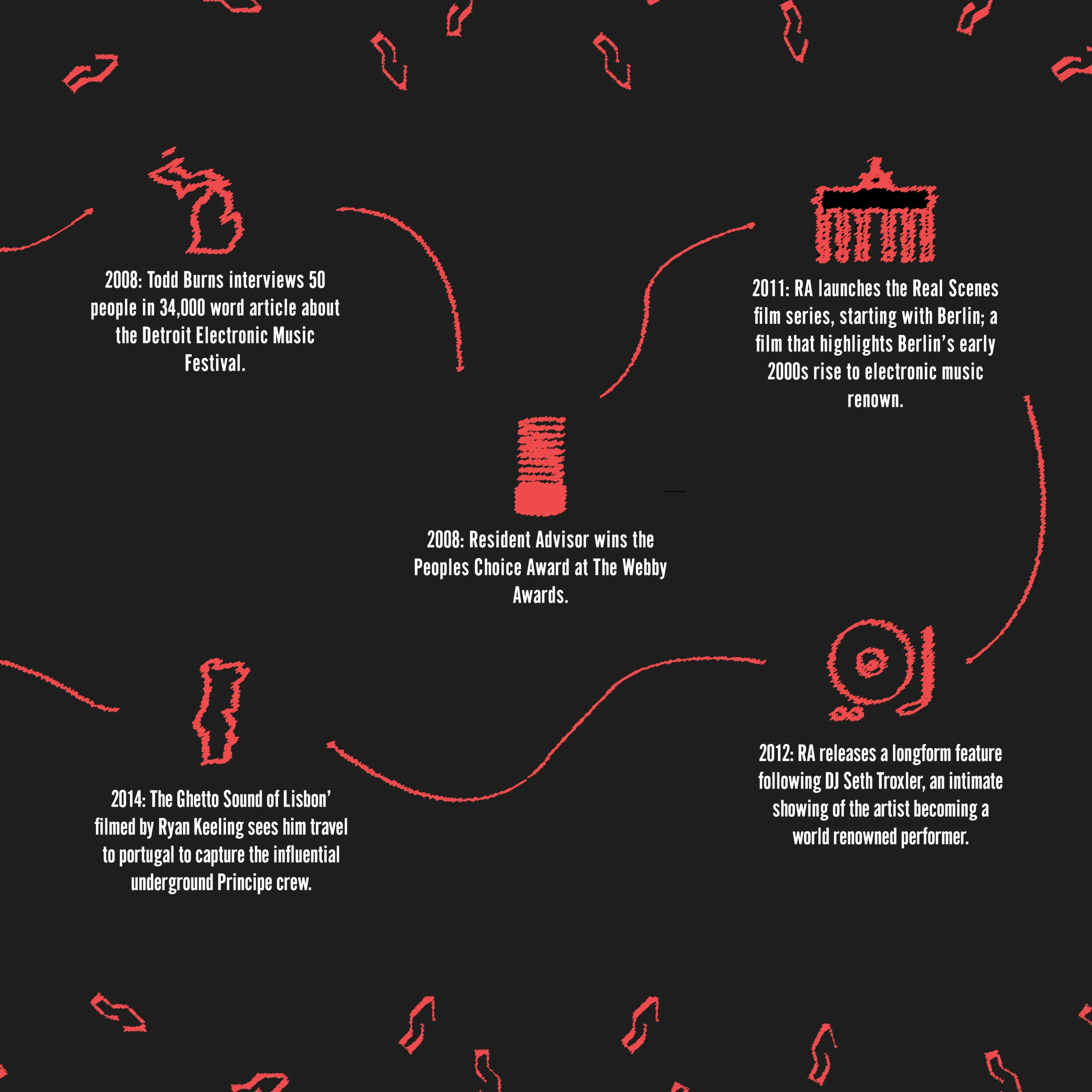
Lastly, one of our outcomes was to design an accompanying booklet for the album project. Therefore, I thought it would be appropriate for this booklet to accompany visitors to the store, with people handing them out as you enter. The booklet contains more detailed information about Resident Advisors History, the timeline graphic and information about what would be on sale at the shop. I thought it was important to carry on the same design style used on the album onto the booklet so there’s a visual connection.
Therefore, the booklet uses the Gothic CG typeface and features graphics from the vinyl such as the modified RA logo and a modified version of the timeline shown on the vinyl inside.