jzd electrical
rebranding

An innovative identity for a forward-thinking electrical repair and eco friendly installations brand.

Designing green

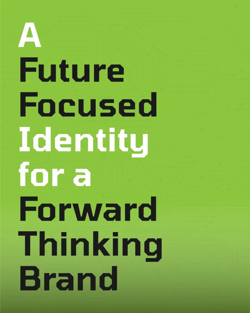
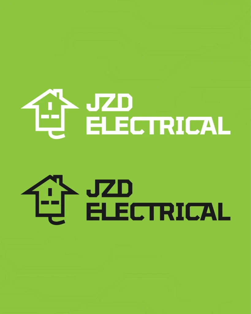
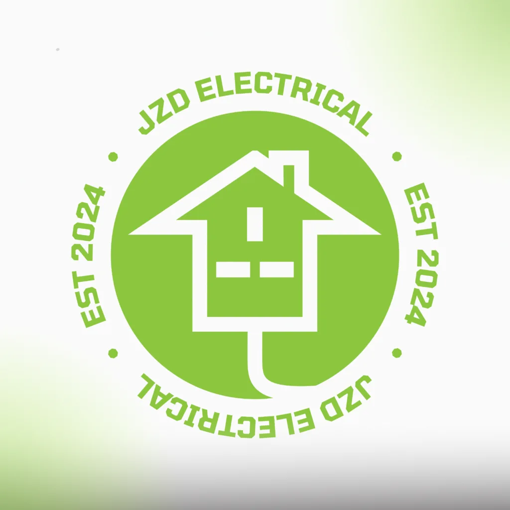
JZD Electrical engaged me to develop a contemporary brand identity that reflects their commitment to excellence in electrical repair and sustainable green energy installations.

To achieve this, I immersed myself in understanding their core values, strategic objectives, and guiding principles, ensuring the identity not only resonates with their mission but also positions them as leaders in an evolving industry.

What do jzd electrical stand for?

With this in mind, I set out to design a logo and typography that embodies these values through a modern, clean aesthetic; projecting a brand that is friendly, approachable, and professional. In the same thinking, the colour palette was carefully chosen to evoke themes of ecology and green energy whilst adding a friendly warmth to the designs.

The logo the client went with draws inspiration from a plug socket, turned into a house symbolizing the brand’s connection to the world of electricity and its focus on eco electrical home improvments. The combination mark seamlessly weaves the text elements together, creating a cohesive and dynamic visual that reinforces the brand’s identity with subtle, playful unity.

Vibrant colors thoughtfully chosen to amplify brand visibility and leave a lasting impression.

The colors were thoughtfully chosen to embody the brand’s dedication to eco-conscious installations, featuring nature-inspired greens that symbolize sustainability and environmental stewardship. These are complemented by a vibrant blue, providing dynamic contrast and visual balance throughout the design.
Eco Green
Ocean Blue