Disruptype

A subversive type foundry created for my final university project, featuring three uniquely designed typefaces and an accompanying branding/advertising package.

typeface #1

kapoor

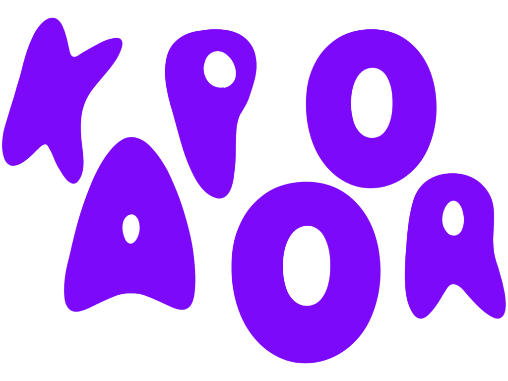
The first typeface began as hand-drawn sketches with the intention of creating letter forms which barely resemble normal lettering, which I then warped and sculpted in Illustrator; bending the lines into further abstract forms.

Once the letters found their voice, I brought them into FontLab, where I played with creating new weights, each variation stretching and reshaping the forms a little more, this led to me creating a variable font version which can be seen in the video below! This variable font was fully functional and was part of an interactive display, where viewers could type and manipulate the letters for my final project exhibition.

typeface #2

Salted

Salted was born from a playful experiment: sprinkling salt into stenciled shapes to form letters by hand. I photographed these designs then brought them into Illustrator, where I refined the gritty details and adapted the forms for clean digital display.

typeface #3

mathematica

Mathematica set out to challenge the traditional idea that typefaces should favor visual harmony over mathematical precision. Instead, each letter was built on a perfectly calculated grid, geometrically flawless, even if it meant sacrificing conventional aesthetics. Here, math took the lead, beauty followed (or didn’t).

Final project exhibition

For the final exhibition I wanted to show of the typefaces by fly posting  screen printed posters feauturing each typeface. These posters were also fly posted (with permission!) around my local area.