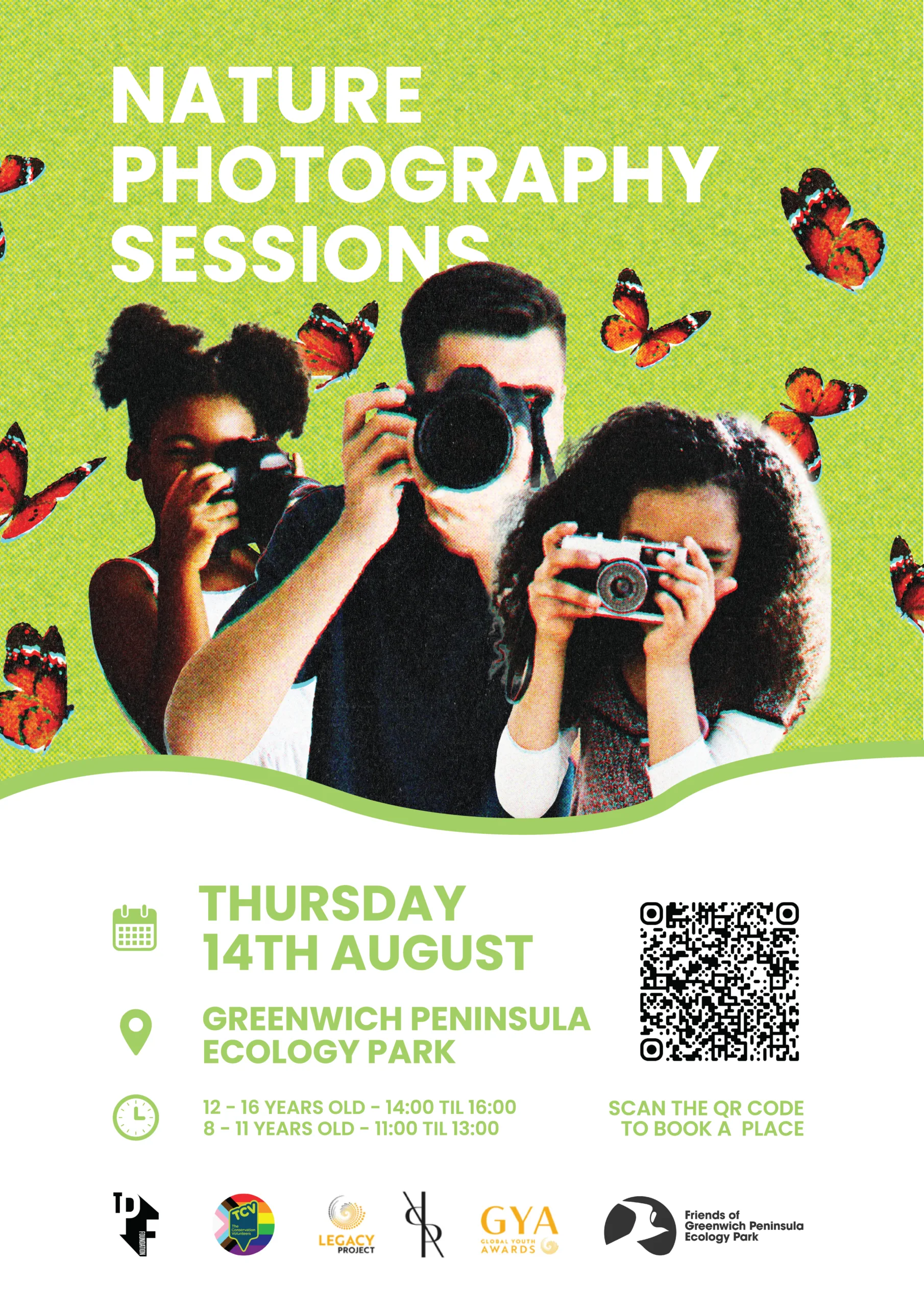
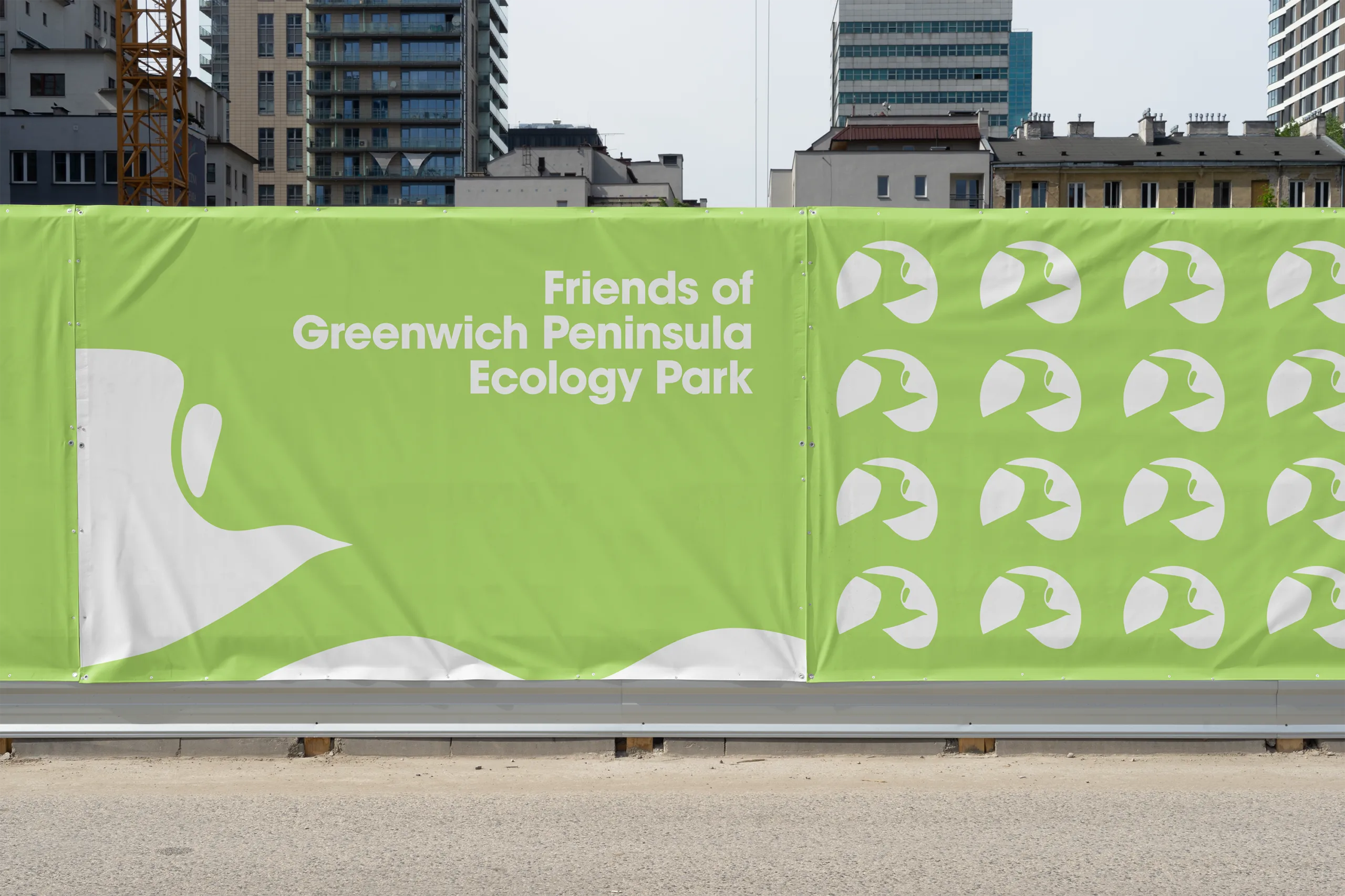
Brave branding, for the bold in nature. Thoughtfully designed, the new branding captures the group’s strong ties to the River Thames and the vibrant wildlife that surrounds it.
The Inspiration...
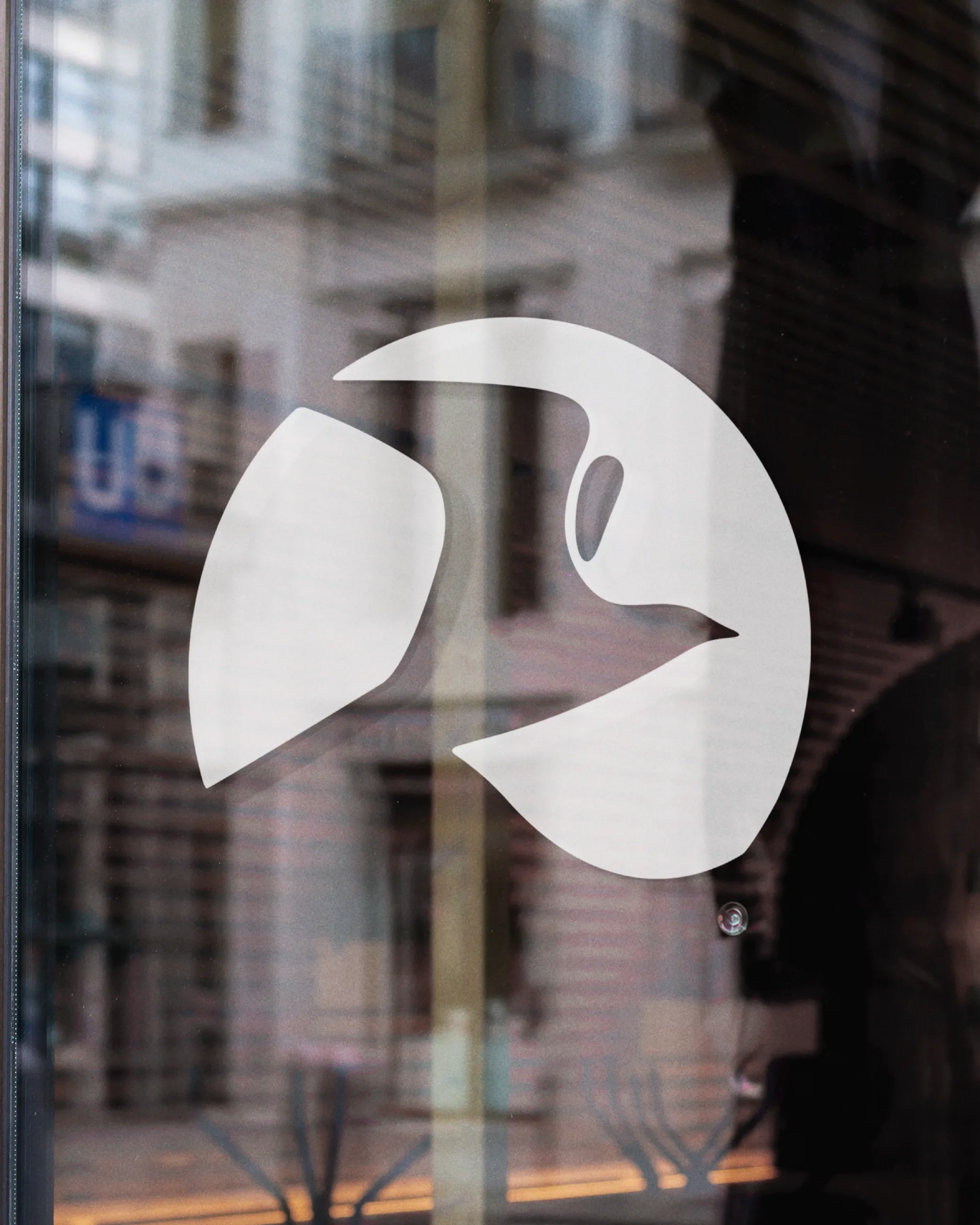
One of the main inspirations for this work was the group’s location around the Greenwich Peninsula, which is reflected in the logo through the curved shape of the River Thames wrapping around the brand mark.
Another key inspiration is the diverse wildlife found throughout the park. This led me to explore various species, with the common tern bird standing out as both distinctive and memorable, a simplified form featured in the logo.
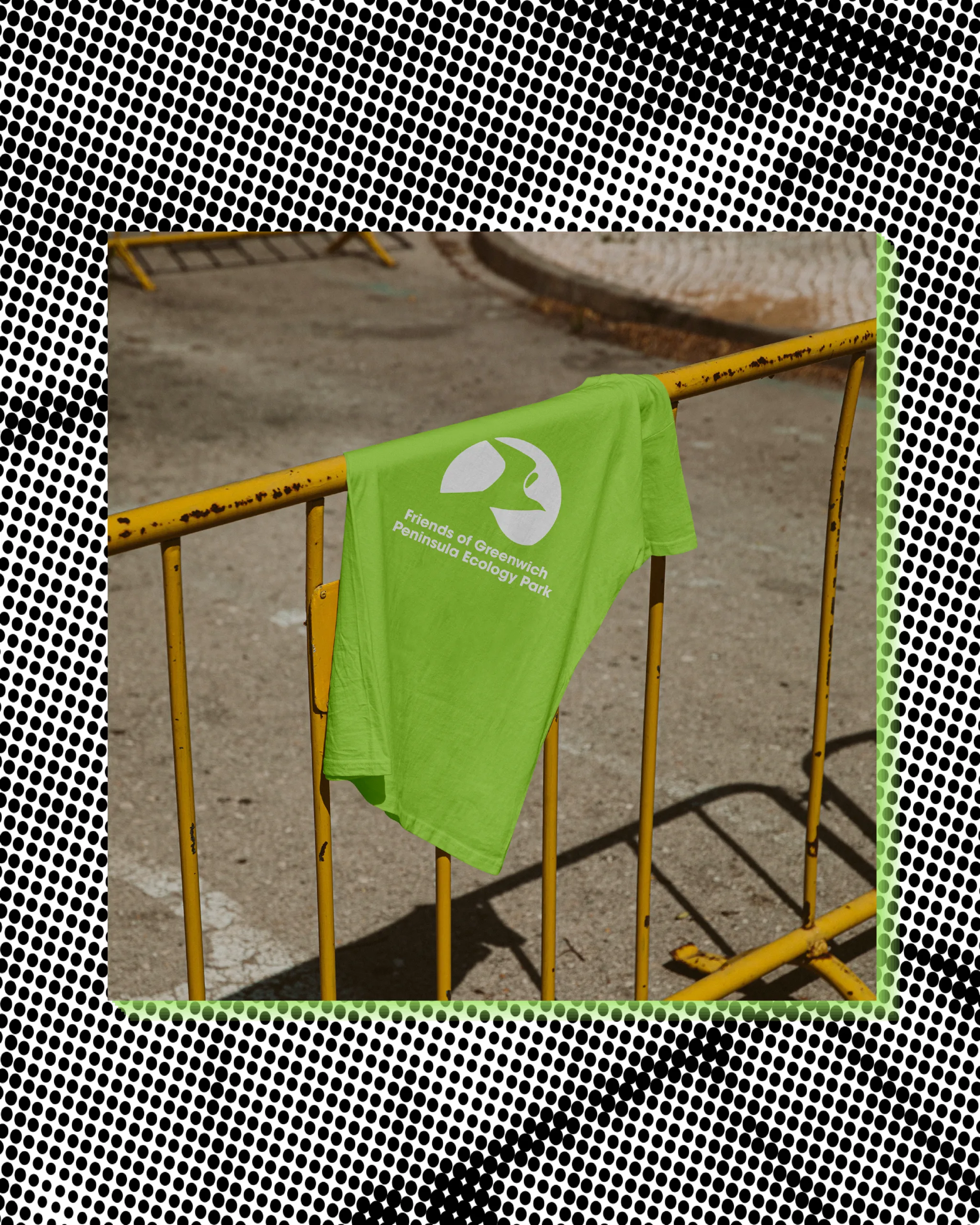
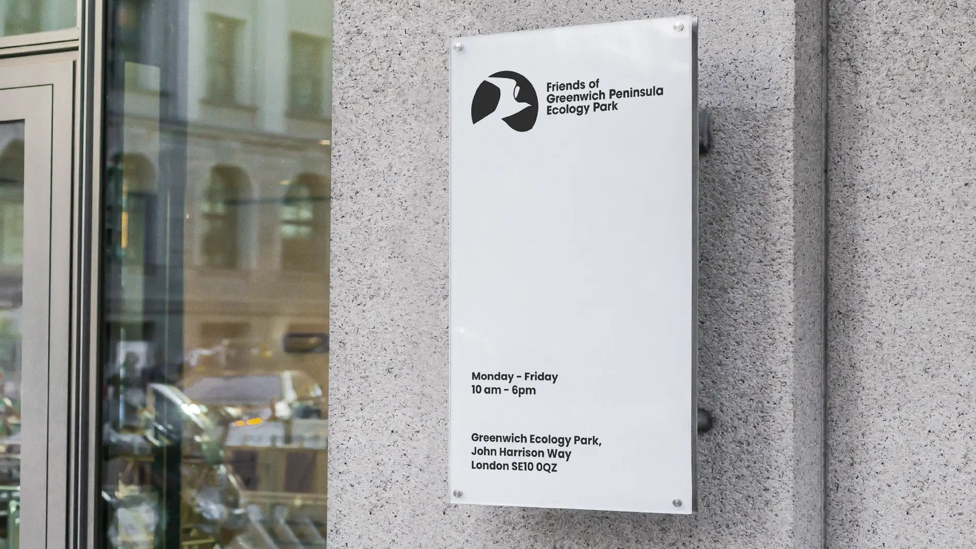
An adaptable logo, designed for different use cases.
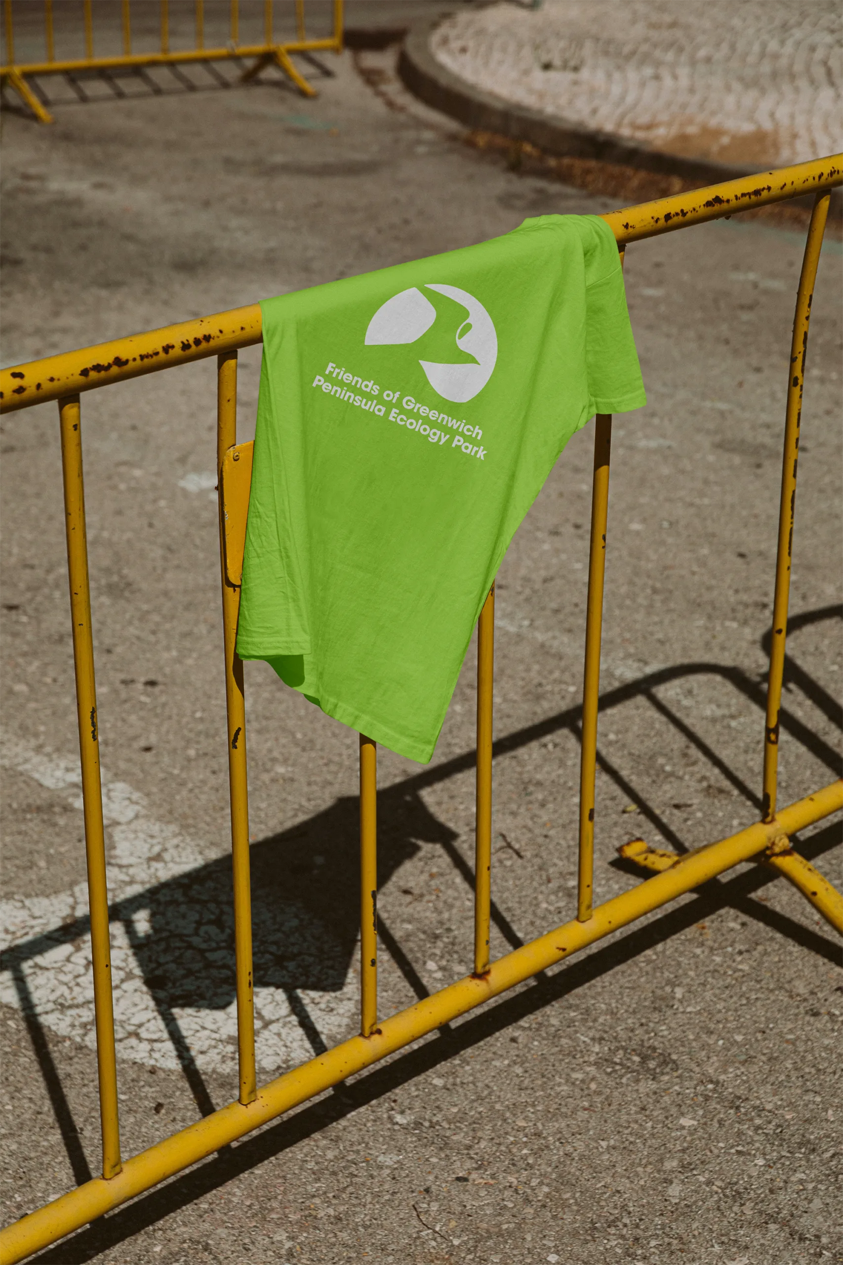
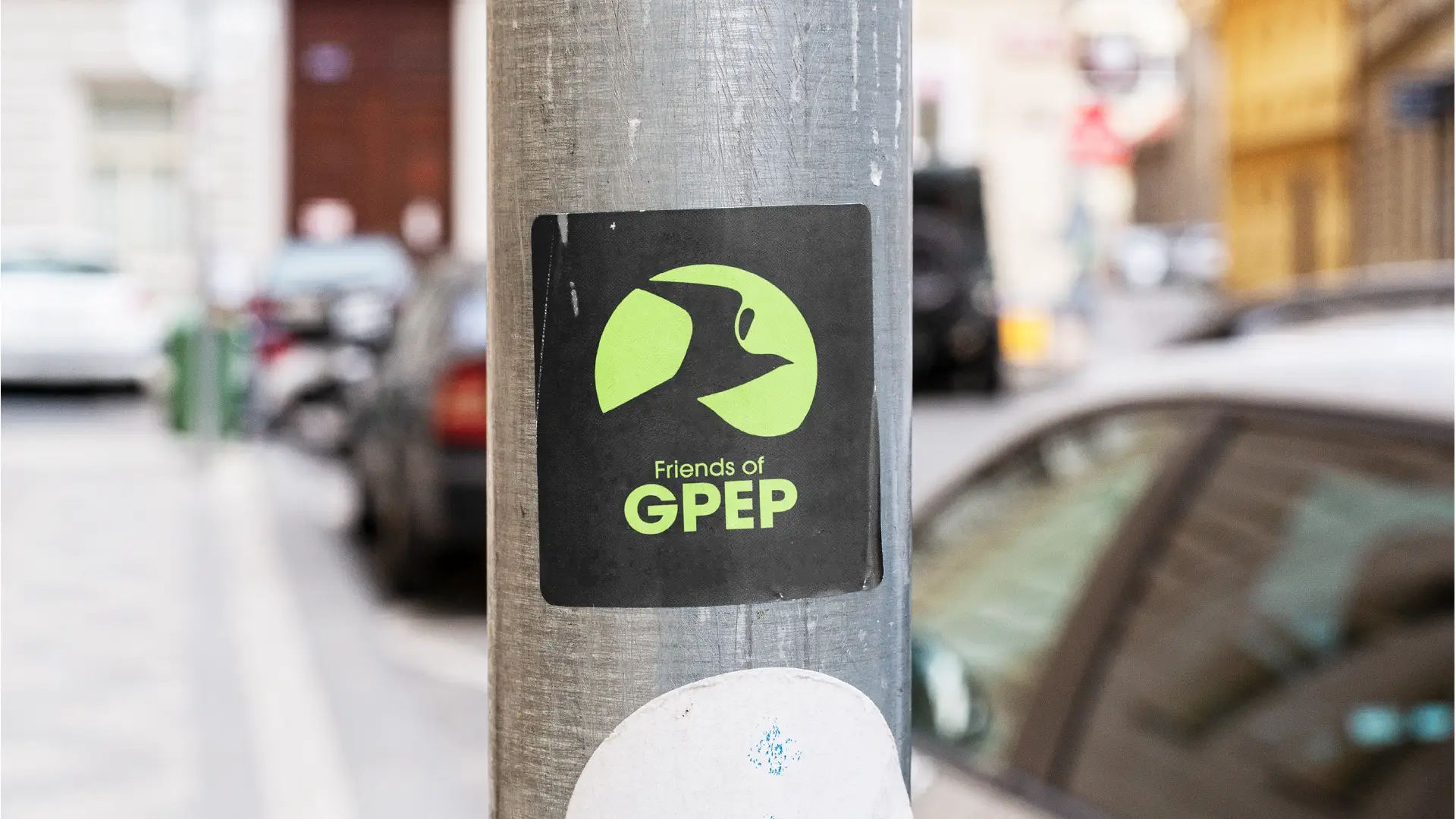
The logo is designed to be versatile across a range of scales, dimensions, and configurations to suit different use cases.
Below are examples of various logo lockups and the primary brandmark.
Striking brand colors that captivate attention.
A carefully curated trio of colors reflects the group’s deep connection to nature. Vibrant eco-inspired greens symbolizing the local environment, complemented by a bold blue that echoes the enduring presence of the River Thames whilst giving the palette contrast.


