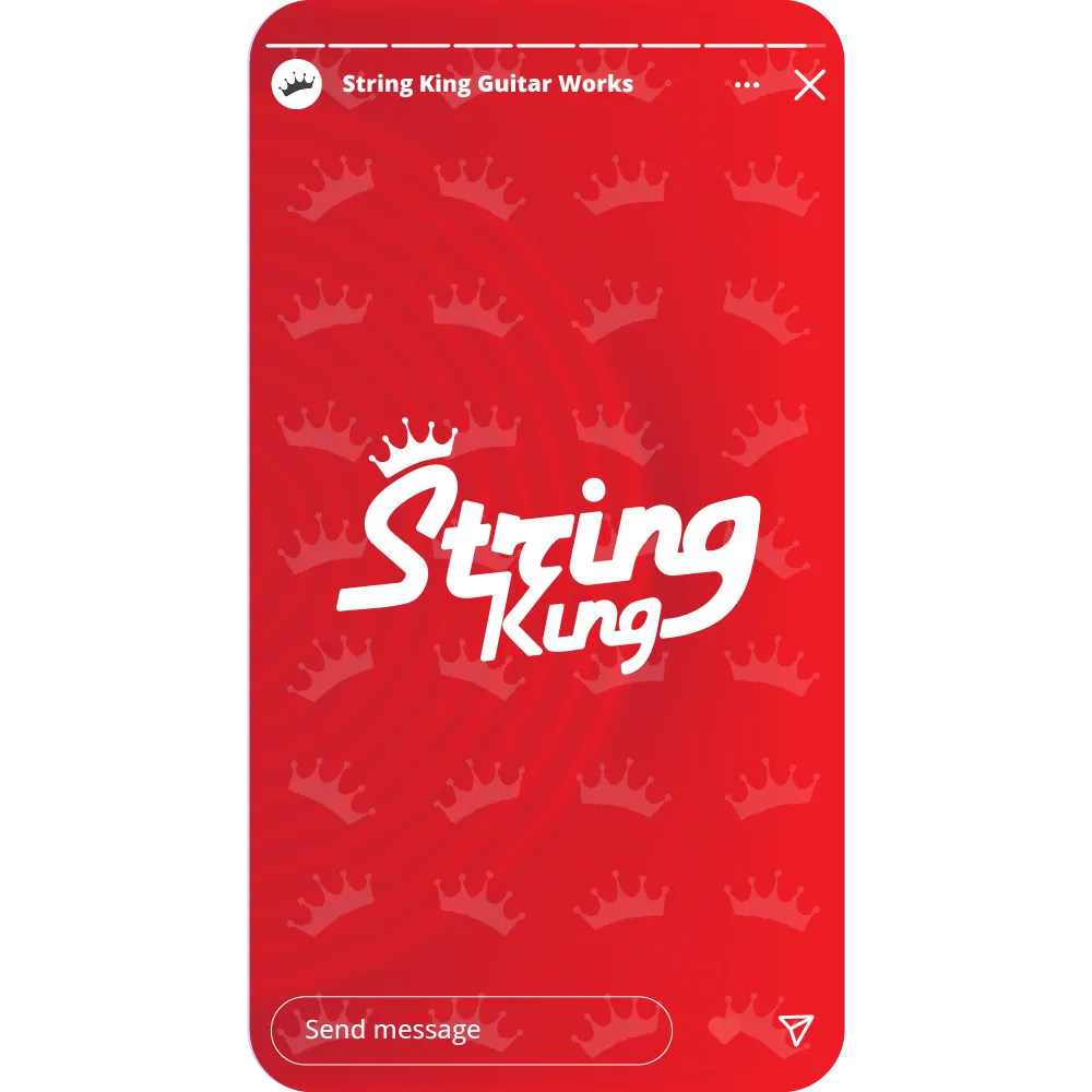
The String King logo draws inspiration from the bold, expressive typography of 20th century rock culture, re-imagined with a modern twist. Using a retro font, the design was refined into a more rounded and universally accessible form to reflect the brand’s approachable yet confident identity.
This project showcases how nostalgic influences can be transformed into a timeless, contemporary mark that captures both heritage and originality.
clarity across diverse formats
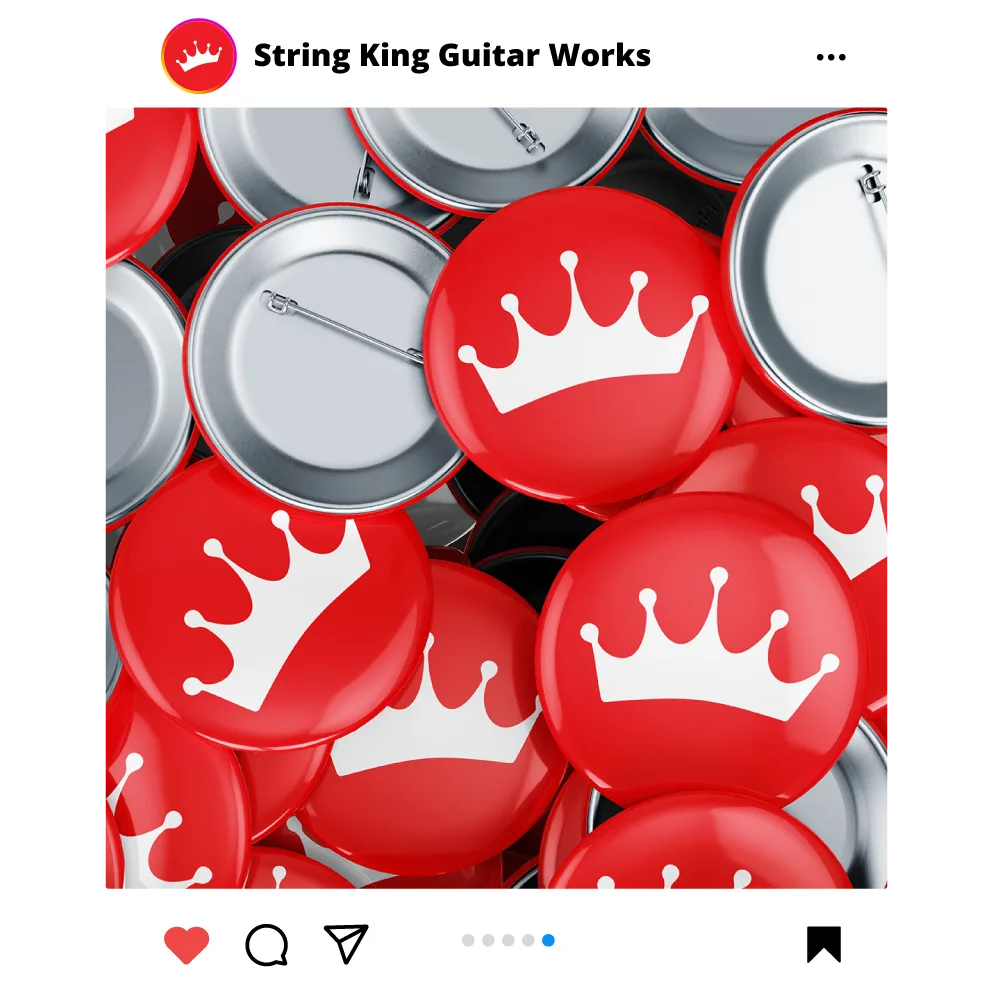
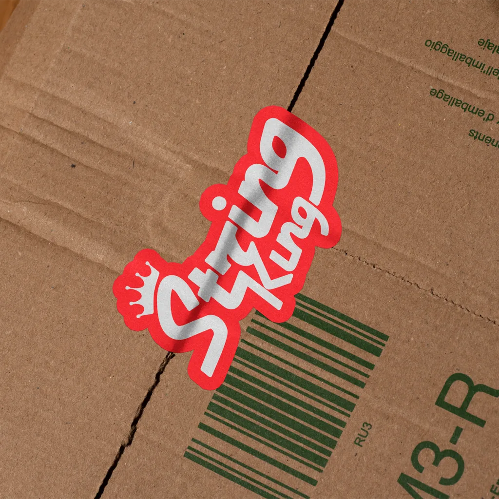
The logo was designed with versatility in mind, ensuring it maintains its impact across a wide range of applications and sizes. For smaller use, the simple crown icon can be used, or for somewhere inbetween, the two letter combination mark.
vintage/modern
typography
The branding includes a cohesive typographic blend: a modified Hamburger Heaven driving the main branding and logo, Kumbh Sans delivers a refined yet modern heading typeface, and Forumpresents stylish, classy body text.
Kumbh Sans was chosen as a alternative to Futura (for liscensing issues), Futura orginally chosen due to its connection to the brands time setting and the typefaces connection to 20th century design.
colours for
the sixties
The brands colours were selected to be bold, friendly and match the rock aesthetic. Placing String King perectly in the fast paced modern branding environment.